Typography is a game that requires a black & white VizionFirst®. Where you see Black, it's lack
of White. When you see White, it's just Black that shows it.
This is a foolproof theory scientifically proven by your optic nerve and then your brain.
Which relation between line and type character?
A common letter doesn’t contains line but is drawn by ‘color’ (Black & White). When we say ‘Outside the line’ what does it means for the concept of a letter?
The line is defined by the transition from white to black aera
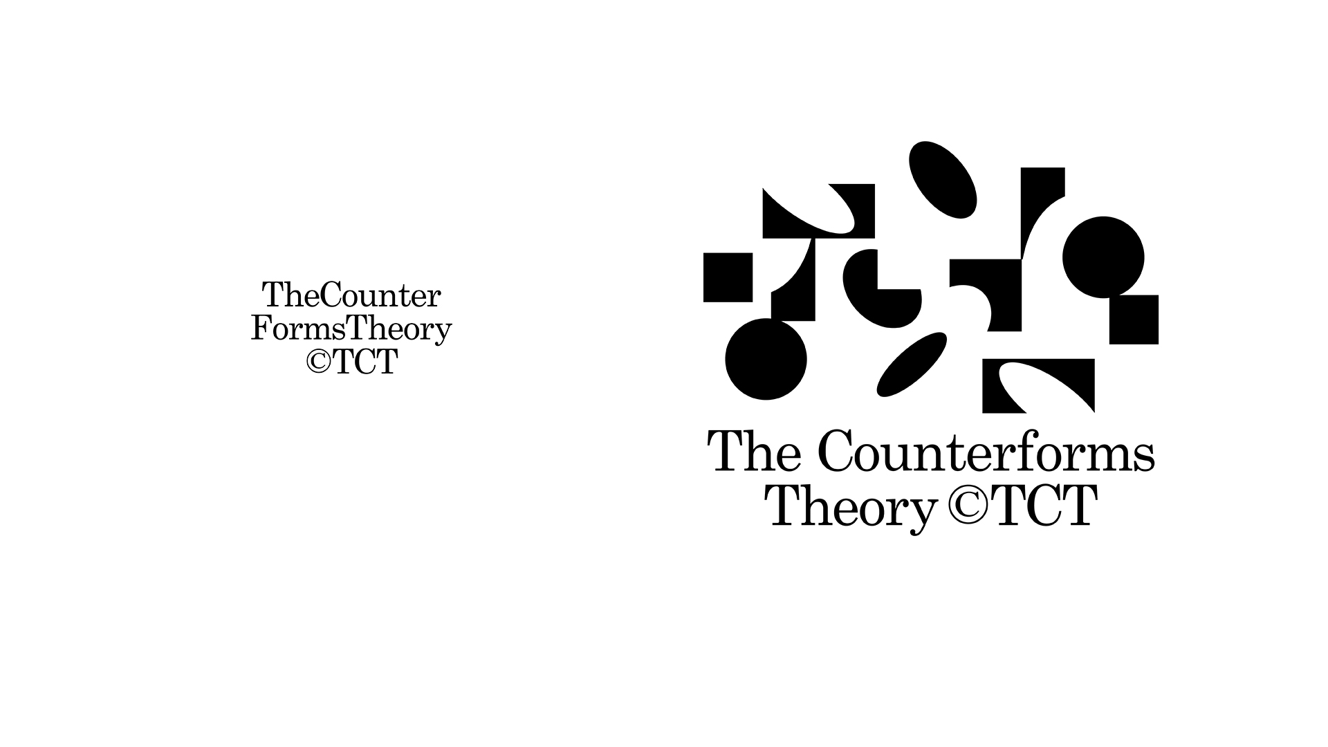
In that way, the concept of ‘Outside the line’ become a concept of ‘Between the forms’. The Counterforms Theory is birth from this relation and applies a linear concept to a formal theory.
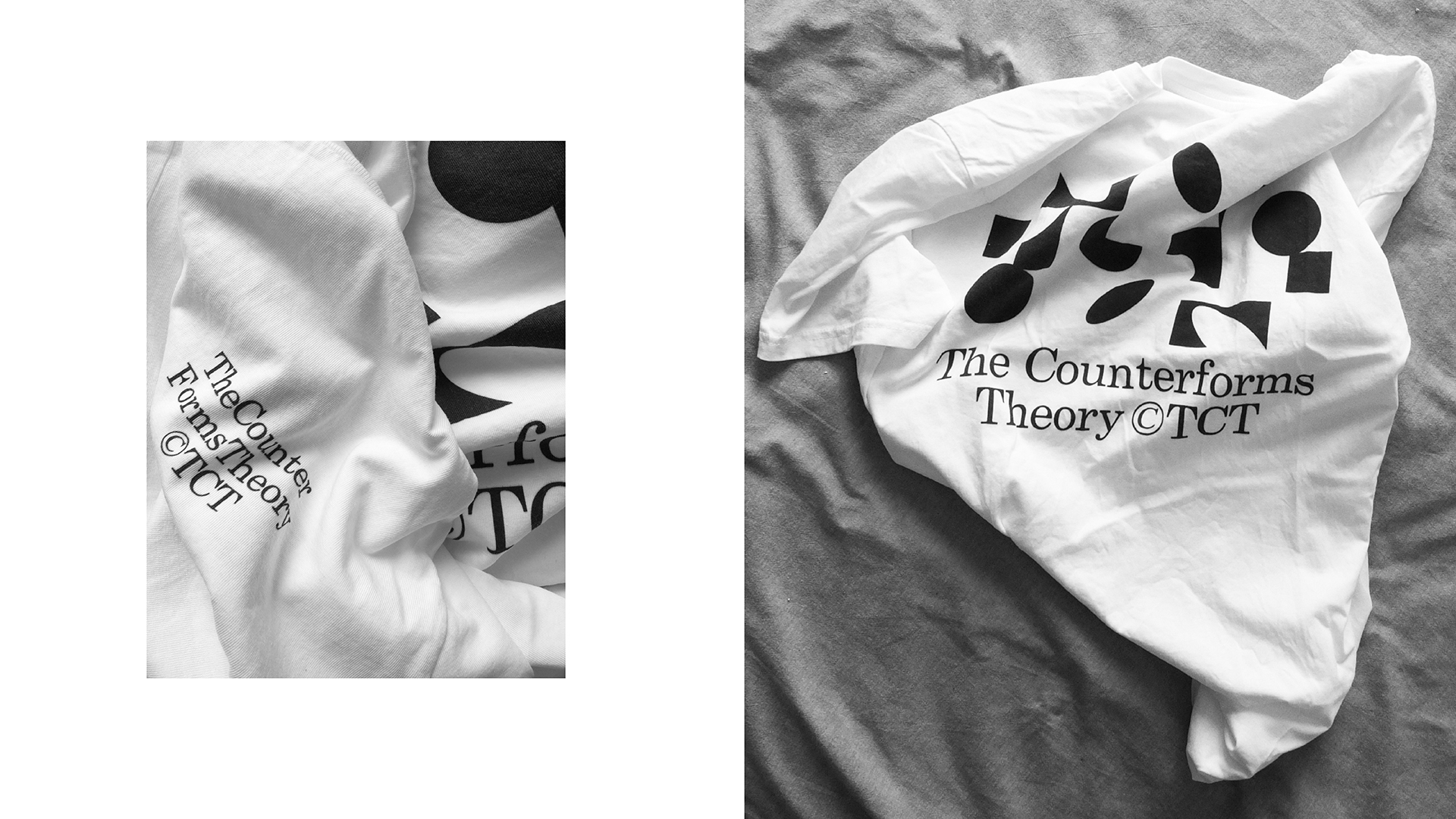
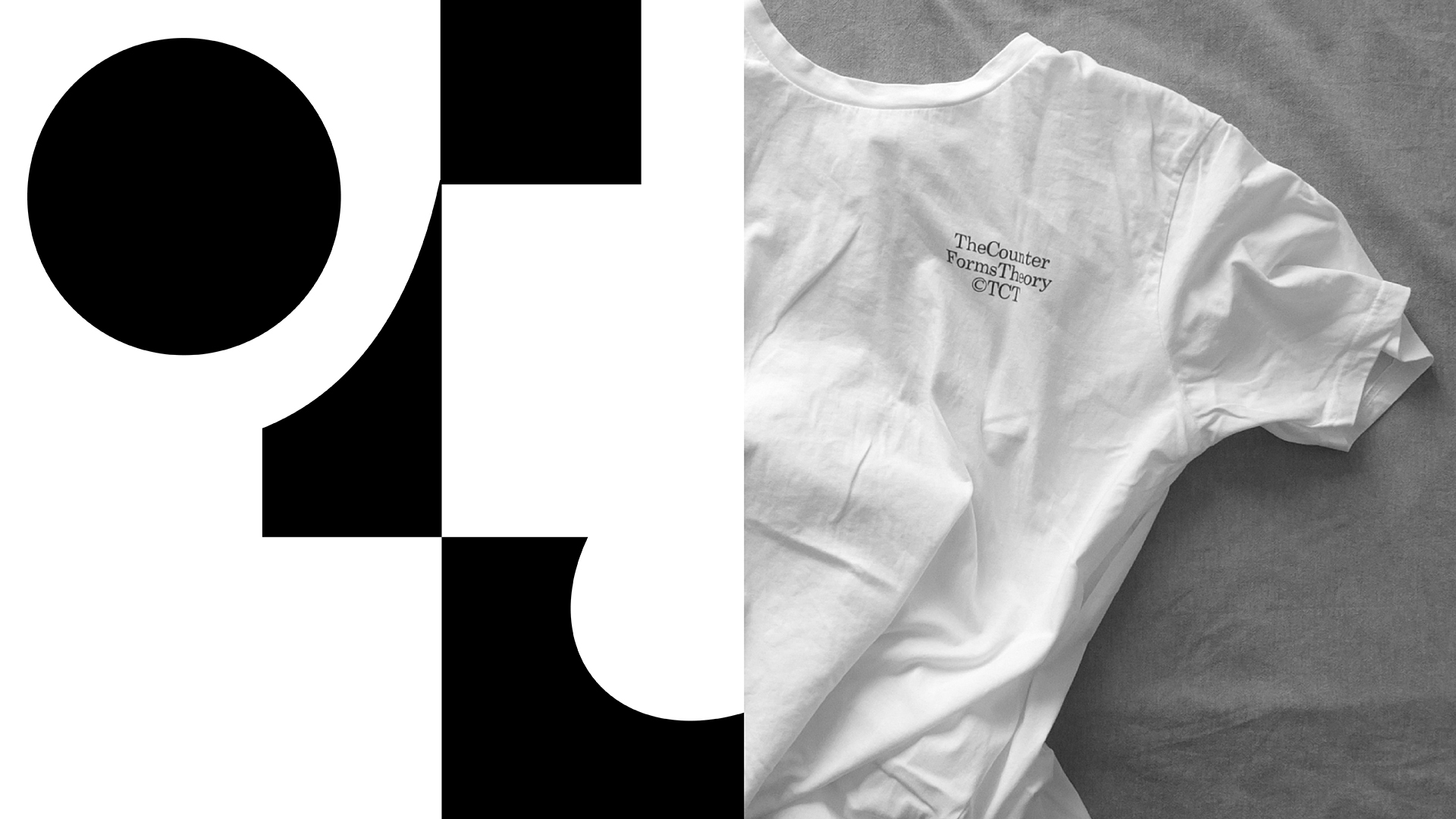
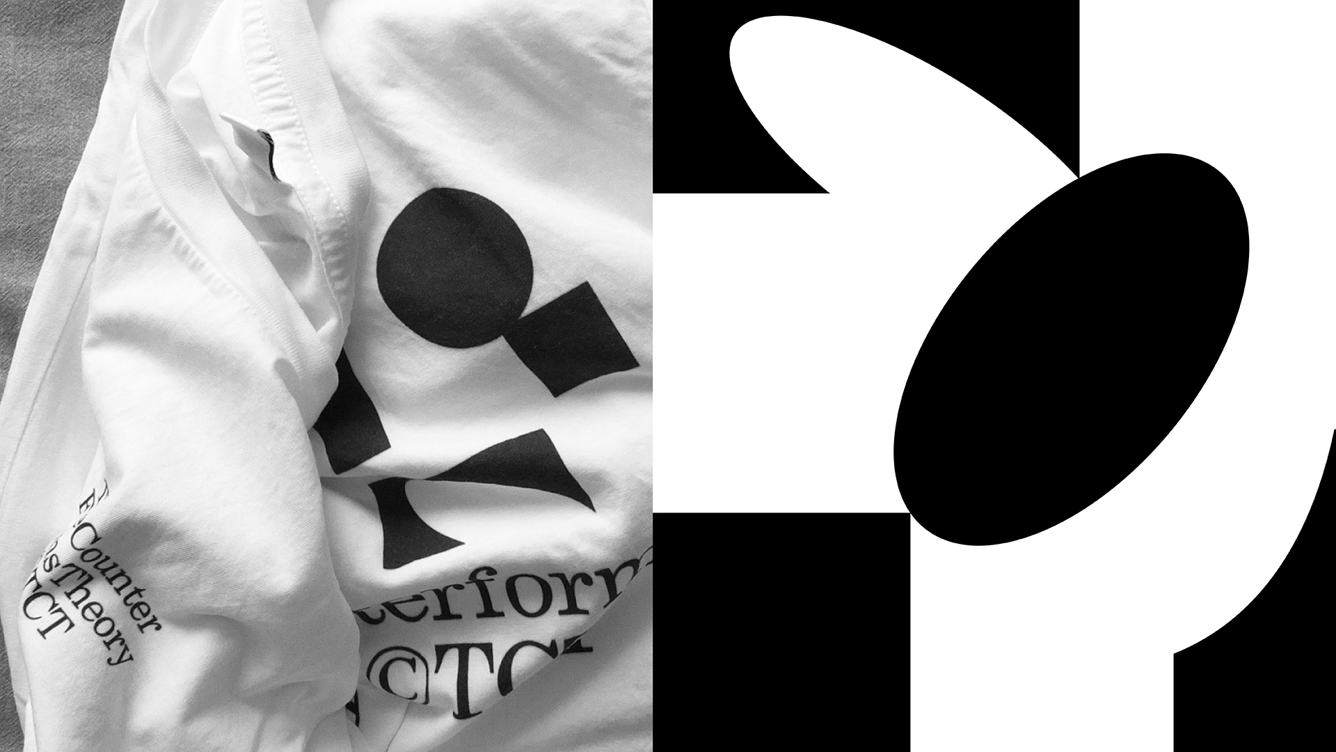
Apparel presented below is illustrating the CounterForms Theory ©TCT with a bespoke graphic in one color (White or Black?) near to the theory’s name typesetting in Century Schoolbook font (Designed by Morris Fuller Benton in 1924 for American Type Founders and publishing by Bistream).
Graphic is focused in obtain a certain visual poetry in placement of the black forms. It’s not a static preview, more a living story through the counter forms.
If you look closely, the forms and counterforms do not match in order to enhance the motion in your beautiful eyes.
The product cut to a regular fit, the Earth Positive T-shirt is made from lightweight 100% combed organic cotton and is Fair-Wear, Vegan and GOTS accredited. It's also Climate Neutral, with 90% Reduced CO2 achieved by better manufacturing.
Apparel are screenprinted in Black on white garment and placed as follow:
- ©TCT mention on the right-top of the front
- Graphic + ©TCT on the middle-top of the back